Announcement of Our new Logo & Brand Identity


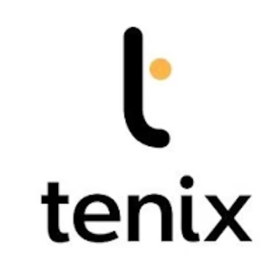
We are proud to announce the launch of the new company logo as part of the ongoing evolution of our company’s brand.

Our business has grown and evolved over the years, and we felt it was time for a change. We have refreshed our logo to reflect who we are today and to symbolize our future.

The shapes used in the logo element are inspired by Public Transport passenger route information. The trunk in the “t” represents the route, and the dot stopped. The simplicity of the logo makes it easy to use.

With this, we aim to present ourselves better and cater your with better services in times to come.

benefits of electric vehicles at bus station in Oslo fördelar med elfordon

How Smart IT Systems Help Bus Operators Achieve – and Exceed – their KPI Targets

In today’s public transport landscape, bus operators face a triple mandate: deliver reliable, cost-effective service, meet stringent environmental regulations, and manage the complexities of electrification. Meeting Key Performance Indicators (KPIs) like punctuality, energy efficiency, fleet availability, and emissions compliance is no longer possible with manual planning or siloed tools.

Read More »
Tenix logo with black text and an orange dot on the left side

Thank you for contacting us.  Your submission has been received. 
We will be in touch shortly.